How the original 96FM logo came to be.
I was the joint Creative Director at Paton Davis Australia (with Kim Newman) at the time when we were assigned the responsibility for the launch of Perth’s first commercial FM radio station.
Although a CD, I was principally a writer. My art directors were Paul Young and Graham Dawson (both now sadly deceased).
Our first task was to come up with a name for the station and a logo.

We finally settled on 6NOW FM and set about designing a logo. We developed hundreds.
Then, while we were workshopping the material with George Chapman (Managing Director at the station) and Gary Roberts in the boardroom, George calmly informed us that the station name would be 96FM.
He pushed a rough scribble across the table in his own handwriting – what we call a ‘chook scratching.’
George explained he had the frequency changed from what it was (I think it was 97.5) to 96.1.
He explained that most tuners would receive the signal when the dial read 96. That way, and if required, the tuner would only require a very minor adjustment to receive the signal at its clearest.
It was the first station to include the frequency in its name. At the time, most dials were still alphabetic: 3UZ, 6KY, 5AA etc, depending on the state in which you lived. With advent of new stereo tuners, dials became numeric. In Sydney, the new FM station was named ‘2Day’ and in Melbourne, ‘EON.’
Of course, Paul, Graham and I were gobsmacked. We’d worked hard to make 6NOW FM work using mainly yellow and black (state colours). But we had to start again.
Then Gary said whatever we did, the logo needed to be ‘electric’ blue. Of course, it is often the case that clients amend the brief.
At home one night a couple of nights later, I saw a musical manuscript - my wife was playing the violin at the time - I noticed an italicised ‘mf’ on it. This stands for ‘mezzo-forte,’ and it meant ‘moderately loud.’
Call it serendipity, call it spontaneous inspiration, call it what you will, I immediately thought that if reversed, it would read ‘fm.’ Plus, it had its origins in music – something that Gary was at pains to explain would be a foundation principle of the new station.
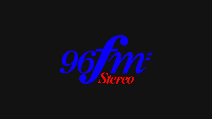
I took the music manuscript into the office and showed Paul. He grabbed the idea and went to work – and eventually came up with a bastardised form of italicised Times Bold, added the numerals ‘96’ and included the musical sign for ‘sharp’ because it represented clarity.
Paul applied Gary’s preference for electric blue to the 96FM and allocated red to the word ‘stereo’ so it would stand out.
Graham – a brilliant illustrator in his own right - finessed the typography so that it was a logotype (it could only be reproduced photographically) and not merely set in type.
He closed up the kerning and thickened the down strokes using a Rapidograph pen and a set of French Curves (both of which are specialist drawing and drafting tools).
He also modified the end terminals of each character on the nine, the six and the f.
Back then, art directors were craftsmen and finessed work by hand. Graham also adjusted the position of the cross bar on the f. These changes, while subtle, helped add visual balance to the logo.
Not long afterwards, Paton Davis Australia was merged with JMA Ogilvy & Mather. Graham and I resigned and formed the Sharper Pencil – a freelance creative consultancy. 96FM became a foundation client.
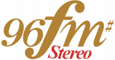
About a year or so later, the colour palette of the 96FM logo was changed to gold and red.


